

3/3/11
Dracula Portrait

For me there's never been a perfect portrayal of Dracula as he appears in the book. There have been many artists' interpretations and many actors who have portrayed him, but nothing truly captures the character as I imagine he is in the novel. This doesn't even come close either. Maybe it's because he's such a famous, fantastical and menacing character that no visual interpretation can do justice to the idea of him.
My favorite version so far is the one seen in Jae Lee's Illustrated Dracula, which I highly recommend to any fan of the novel and the character.
6/3/10
Remakes
Hollywood loves remakes. They guarantee at least a modest financial success and don’t require a lot of creative effort. We, the audience, have a love/hate relationship with remakes. However much we might groan at the news of another classic film or franchise getting a remake, inside there’s that glimmer of excitement at the prospect of seeing renewed interest in something we love, and in seeing it re-imagined into something new. The hope of anyone going to see a remake of one of our favorite classics, is that it might just give us that same feeling we got when we saw the original for the first time.
In recent years the Reboot has become even more popular, since it brings that nostalgia feeling that remakes offer, without the negative stigma attached to calling something a remake.
Remakes seem to have the worst obstacles to overcome in the eyes of critics and filmgoers alike. A remake is generally seen as a poor attempt by lazy Hollywood producers and writers to cash in on the classic status of older films. At best they can only ever be a loveable homage to the original and at worst an insult to what was originally a brilliant work of cinema.
There are a lot of reasons why remakes tend to far well below the status of their predecessors.
One reason is that the producers don’t get what made the original a classic. A lot of remakes tend to fall flat because producers fail to see what it was that made the original film so great to begin with. Often times careful, deliberate pacing or clever character development will be replaced by explosions and one-liners. Remakes tend to pander to the lowest common denominator. Hollywood execs tend to think that creating a remake just means adding new effects while ignoring characters and plot.
Another reason is nostalgia. Nostalgia is probably the most powerful enemy as well as the strongest ally of any director seeking to recapture lightning. Nostalgia is the reason a lot of remakes get made in the first place. Even the most cynical of us will at least be curious enough to check out a remake because it’s something familiar, it rekindles our love of the original and reminds us why we loved it in the first place. But nostalgia can also work against the remake. We hold classic films in such high regard that even the best remake falls flat simply for not being the original.
This is why a lot of critics dismiss remakes out of hand or at the very best admit that a remake might be a good film, but not as good as the original. But no remake is ever quite as good as the original they are based on, no matter what. I think a lot of this tends to come from critics who really want to be sophisticated by clinging to the old, the “classic” and completely dismissing anything new or “mainstream.” Sure a lot of remakes miss the point, but some of them not only manage to properly honor the classics, they even surpass them. We’re just reluctant to admit that, for fear of appearing un-sophisticated in the eyes of our geek peers.
So, in the spirit of opening up and giving remakes a chance, here’s a look at five remakes that I personally think are at the very least equal to their originals if not better. These are all the best examples of what a remake should be.
5. The Mummy
The sequels were awful, but Stephen Summers’ initial remake of The Mummy is a really fun movie. It has comedy, action, adventure and some genuinely scary scenes. I love how Imhotep is like a living apocalypse, bringing plagues with him wherever he goes. I absolutely hated how this was downplayed in the sequel so that he simply has telekinesis. The less said about The Scorpion King the better.
I’m not really going to compare this one with the original because I’ve only seen the original once and honestly, this only makes the list because I needed a fifth and as remakes go this movie was really good.
4. King Kong
Peter Jackson’s remake of the 1933 classic is far from perfect. There’s a lot of pointless padding to the plot, a couple of dodgy effects shots, and entire plot threads that go nowhere. But it is still a remarkable film. When the effects work, they really shine through, particularly with the performance of Kong. Jack Black’s Carl Denham is a much more rich and fascinating character than the original. The supporting cast are all interesting characters in their own right. My only real complaint with the film is that one character, Jimmy, is given a lengthy setup for a mysterious back story that is heavily implied to be tied up with Skull Island, which is never resolved. His character ark goes nowhere and his mysterious history is never revealed. There are some lengthy scenes on the island that feel like needless padding, yet I can’t really think of a reason to cut any of them. The greatest thing about this remake; the choice to set it in the period that the original took place. Not only does this tie it to the original but it also makes it easier to accept this story taking place in a time when the world was becoming industrial but there was still just enough mystery left unexplored. Peter Jackson’s King Kong not only pays homage to the original but it stands on its own as a beautifully crafted film.
3. Charlie and the Chocolate Factory
I may be prejudiced in that I never loved the original Willy Wonka. As a child this surreal and nightmarish film scared the bejeezus out of me. I first saw it when I was about six years old and for a year afterward I was terrified of chewing gum. I avoided seeing it again for years, but it nevertheless left a mark. Like all kids I did have fond memories of the Oompa Loompas and the glass elevator and Gene Wilder in a purple suit.When I heard Tim Burton was remaking it, I shrugged it off because I just didn’t care enough about the original to bother caring about a remake. Then the posters started showing up and I got excited. Tim Burton’s version of the story is a visual masterpiece. Johnny Depp is as brilliant as Willy Wonka as he is in every film. To me this was a shining example of a remake that is far superior to its predecessor. Now I understand that most people are so fond of the original for this remake to ever hold up, and in the cultural mind Oompa Loompas will always be orange and Willy Wonka will always have bright orange hair. That’s something no remake could ever change. But to me, this is the better film.
2. The Wolf Man
The most recent film on this list, and the inspiration for this article. It is the only true remake ever produced of the most famous, most iconic werewolf film. The original Wolf Man was not only one of the earliest werewolf films but also one of the best. Jack Pierce’s iconic makeup design defined what a werewolf was for decades. Lon Chaney Jr’s performance was his very best work. The film along with its sequels provided most of the modern conventions of werewolves. But most importantly this was the first, and one of the very few, films to actually understand what makes werewolves compelling monsters. The story of the Wolf Man is a tragedy. It’s the story of a man who is cursed. Where most werewolf films, particularly after the eighties, would focus on gore and action, the Wolf Man was focused on what makes Lycanthropy a curse. Lon Chaney’s Lawrence Talbot is a man who must live with the guilt of knowing what he has done as a monster he cannot control. And Chaney pulls it off brilliantly. Despite being a creepy voyeur who spends most of the film stalking a girl who’s clearly not interested, Chaney’s Talbot comes off ultimately as a sympathetic victim. We feel his tragedy through his eyes. Of all the Universal monster films, this was the most heartfelt.
Now let’s look at the remake. And let’s be honest; the first thing anyone cared about was what would the monster look like? Many of us who are fans of the genre and of classic cinema were relieved to hear that in the remake the Wolfman’s design was based on the original and that Rick Baker would be handling the makeup effects. It was a troubled production, with the original director pulling out just before filming, but the end result pulled through. The Victorian era setting, the atmosphere, the cast, the props, everything fell into place to make this a superb retelling of the original. I especially love that the setting was changed to Victorian England, as I’ve always imagined the story ought to take place in the same period as Dracula and Frankenstein. I especially love the look of the hirsute creature. It’s loyal to the original but much more so what the original was meant to be. The original Wolf Man design was really very silly. I mean, he just gets really hairy and changes his clothes. His hair is well groomed, his shirt is clean and tucked in, and he changes his clothes! Every time he transforms in the original, no matter what he’s wearing, in the next scene he’s in a dark shirt buttoned up and tucked neatly into his dark slacks. Think about that; he transforms into the monster and then walks over to the closet and changes his clothes! I know it’s just the result of limited makeup and trying to make him look darker and more sinister, but when you actually notice it, it’s just silly. And when he attacks his victims, he just throttles them. He’s really not threatening at all. The remake is the wolfman as we imagine him to be; fast, ferocious, terrifying. We get to see him as a shadowed form running through the dark woods, all claws and teeth.
Everywhere in the remake are little nods to the original but in a more intricate story. This film is in every way a distillation of what made the original a classic. This is the wolfman. The only area in which this film falls a little flat is the introduction of another wolfman as the villain in the second act. This makes for a great final showdown, but it detracts a little from the great tragedy of the original. The original is all about how Lawrence has to confront the guilt of what he’s done. The villain is himself, and his only redemption is in his own death. By introducing a second werewolf who is intentionally monstrous in the remake, Lawrence’s curse is diminished. Sure he still goes on rampages and kills people, but now it’s only in self defense as he attempts to stop the true monster that threatens those he loves. He goes from being a victim to a heroic martyr. It’s great, but it’s not quite as tragic. Still, the emphasis on the curse remains relevant enough to keep the remake from missing the point completely. One of the things that surprised me the most was Detective Aberline. When I heard that this character would be included in the script and that parts of the film would take place in london I immediately suspected that the story was going to tie the Wolfman story to Jack the Ripper. I was very pleasantly surprised that this was not the case.
5. The Thing
The Thing is hands down the most successful remake ever. It’s so good that few people are even aware that it’s a remake. In fact, I still haven’t seen the original in its entirety. John Carpenter’s The Thing is such a great remake that it’s considered a classic over the original. In fact a new remake of The Thing has been circling around development hell for a couple of years, with most fans and critics balking at the idea because how can you top John Carpenter’s classic?
4/26/10
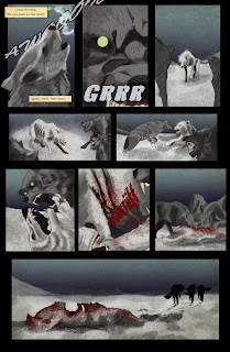
Dracula vs The Wolfman is up!
This was a project I worked on for my Comic Illustration class. I had the idea of doing a Dracula VS The Wolf Man comic after reading a really disappointing comic with that title, which didn't actually feature either of those characters. My concept was to continue the story of Dracula following the novel, with him returning in a weakened form and working his way up to a full resurrection, along the way encountering Lawrence Talbot and having a final showdown in the end. These were going to be the first six pages. I haven't given up on this project but I'm reworking some of the ideas.




2/17/10
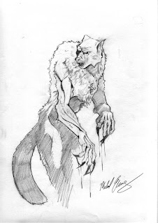
Dracula Vs Wolfman Concept sketches
Here are some more concept sketches for that comic I'm working on. Hopefully I'll be able to start posting actual pages soon, but I'm still trying to figure out exactly what style I want to use on the art.



12/12/09
Merry Christmas
Michael Bay's second outing with the Transformers franchise may have been a disappointment, but it did make me nostalgic for the original version. Ravage and the Baroness were teamed up occasionally in the comics, and since it's getting close to Christmas I felt like doing a fun little illustration of them.


12/9/09
His Majesty's Dragon
Naomi Novik's Temeraire series is about an alternate history in which the Napoleonic War is drastically altered by the inclusion of an aerial force made up of men piloting dragons. It's original not only the setting but also in the way that dragons are crewed by a group of gunners and brigadiers rather than a single dragon rider, like you would see in most other fantasy fiction involving dragons.


12/2/09

11/20/09
The Rising
Here's the final version of the Cthulhu Painting I've been working on. You don't often see Cthulhu rising on a bright sunny day. But, you know, Cthulhu doesn't care about the weather. When the Deep One awakens, he's not going wait for a thunderstorm or a hurricane. The stars only need to be right, they don't have to be visible.

11/18/09

Cthulhu Emerges WIP
Here's a work in progress of a Cthulhu Painting I'm working on.
I started with some rough painting of the kind of water I wanted, then I moved on to manipulating a photo element I got from CGTextures.com

Next I laid in the rough shapes and built on them until I had this rough painting.

Then I added some wave effects

Then I threw in some seagulls to add depth.

And now I've decided to make it a wider image, so this is where it's at now.

Here's a rough sketch that I did while I was considering how to tackle this painting. It needed to have some kind of environment, so originally I was thinking of showing him on the sea floor in R'lyeh. Here I was just experimenting with some lighting choices and trying to think of how to convey a murky underwater environment.

I started with some rough painting of the kind of water I wanted, then I moved on to manipulating a photo element I got from CGTextures.com

Next I laid in the rough shapes and built on them until I had this rough painting.

Then I added some wave effects

Then I threw in some seagulls to add depth.

And now I've decided to make it a wider image, so this is where it's at now.

Here's a rough sketch that I did while I was considering how to tackle this painting. It needed to have some kind of environment, so originally I was thinking of showing him on the sea floor in R'lyeh. Here I was just experimenting with some lighting choices and trying to think of how to convey a murky underwater environment.

Copyright
This was an editorial illustration about copyright, inspired by the Shepard Fairey/Mannie Garcia controversy.


11/9/09
The Killing Joke
As a project for a sequential art class, I re-designed three pages and the cover from a classic comic book. I chose Alan Moore's "The Killing Joke." Part of the challenge was to re-design Batman and the Joker.

How do you re-design Batman? He's seen countless incarnations already. Do I re-imagine him as though he'd never been seen before, or do I just try to do a new take on the established iconic design?
I leaned toward keeping him immediately recognizable. The first thing I knew was that I wanted his whole face to be covered. The current incarnation of Batgirl has a similarly covered face, and I've always thought that to be truly unrecognizable and terrifying Batman shouldn't have any of his face showing.
I thought about focusing on either enhancing the fear aspect of the Batman persona or trying to portray him more realistically than has ever been done.
Superhero costumes in film is a tricky thing. The costume needs to be believable, but also look really good. Most superhero costumes in movies are designed to look like the hero just put it on quickly when in fact, it takes a team of professionals to get the actor into the outfit and then it has to be photographed so that the seems don't show. Spiderman's mask, for example, is part of a single piece top that the actor wears so that we don't see the seem. But we should see the seam. We all know that it's there. Why try to hide it? Batman is always shown with black makeup on around his eyes so that we only see the whites under the mask. But if he takes the mask off, the makeup is gone. It should still be there. Why hide the reality of the effect, especially when realism is what the filmmakers want? Why do lightsabers clip to Obi-Wan's belt, but don't have belt clips? Why does Batman wear a rubber suit that no real person would ever be able to move in?
So I drew a version of Batman in modified riot gear, because that's something that could really work for him.

But ultimately I went with a more shrouded, more spectral look for the Dark Knight. Part of Batman's mission is to terrify criminals, but he doesn't really look that scary. So I wanted him to look like some kind of ghost, a living shadow. He could come out of anywhere.

Of course, that didn't take very much effort to just make him a darkened form, so I had to know what was under his cape. I wanted his outfit to completely reflect this shrouded look, so in place of tights, I gave him an outfit inspired by a holy crusader, to fit with the Knight theme, and also give him a lot of layers of flowing fabric.

For the cover I wanted to try something kind of surreal. I tried to make the Bat logo appear as though it were just a suggestion of the falling rain.


How do you re-design Batman? He's seen countless incarnations already. Do I re-imagine him as though he'd never been seen before, or do I just try to do a new take on the established iconic design?
I leaned toward keeping him immediately recognizable. The first thing I knew was that I wanted his whole face to be covered. The current incarnation of Batgirl has a similarly covered face, and I've always thought that to be truly unrecognizable and terrifying Batman shouldn't have any of his face showing.
I thought about focusing on either enhancing the fear aspect of the Batman persona or trying to portray him more realistically than has ever been done.
Superhero costumes in film is a tricky thing. The costume needs to be believable, but also look really good. Most superhero costumes in movies are designed to look like the hero just put it on quickly when in fact, it takes a team of professionals to get the actor into the outfit and then it has to be photographed so that the seems don't show. Spiderman's mask, for example, is part of a single piece top that the actor wears so that we don't see the seem. But we should see the seam. We all know that it's there. Why try to hide it? Batman is always shown with black makeup on around his eyes so that we only see the whites under the mask. But if he takes the mask off, the makeup is gone. It should still be there. Why hide the reality of the effect, especially when realism is what the filmmakers want? Why do lightsabers clip to Obi-Wan's belt, but don't have belt clips? Why does Batman wear a rubber suit that no real person would ever be able to move in?
So I drew a version of Batman in modified riot gear, because that's something that could really work for him.

But ultimately I went with a more shrouded, more spectral look for the Dark Knight. Part of Batman's mission is to terrify criminals, but he doesn't really look that scary. So I wanted him to look like some kind of ghost, a living shadow. He could come out of anywhere.


Neon Fairy
Created as a T-shirt design for young girls, this fairy is a free spirit with a sense of wonder, a desire to learn and grow as she explores the world around her. She teaches girls that they should be free and independent as well as open to new ideas, that they can spread their own wings and soar to whatever stars they set their hearts and minds to find.


In the Lair of the Sea Witch
I was thinking about how to make the sea witch from The Little Mermaid look frightening. If you look closely at her face, you can see how she's covered in cuts and gashes.


11/4/09
The Watcher in the Dark
Here's another piece that came out of subtractive shading. I started with the eye, going white on black. Then I decided I wanted the iris of the eye to be providing light to the skin, which eventually led to the idea of having all the hair tipped with lights, as though all her hair were fiber-optic.


The Brides
The Brides of Dracula. This was an experiment in subtractive shading.
Vampires should be terrifying.

Vampires should be terrifying.


Alien Lights
This started as a potential character design for one of Conceptart.org's character of the week projects.


Subscribe to:
Posts (Atom)


 Posts
Posts


